If you've ever put something on and known immediately it was wrong without being able to say why, that's temperature. Understanding it changes how you see everything you already own.
Warm and cool
Every colour sits on one side of a temperature line.
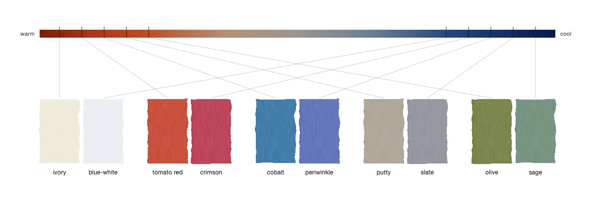
Warm colours (camel, ivory, olive, terracotta, rust, gold, cream) have a yellow or orange base underneath them.
Cool colours (grey, white, navy, dusty blue, lavender, emerald) have a blue or purple base.
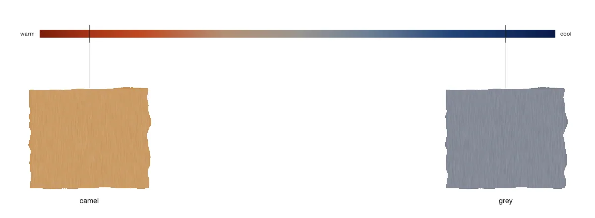
Most people know this in theory and apply none of it in practice. Partly because the colours that cause the most trouble are the ones that seem neutral. Camel and grey both feel like neutrals. But they're on opposite sides of the line, and clash.
Why they fight
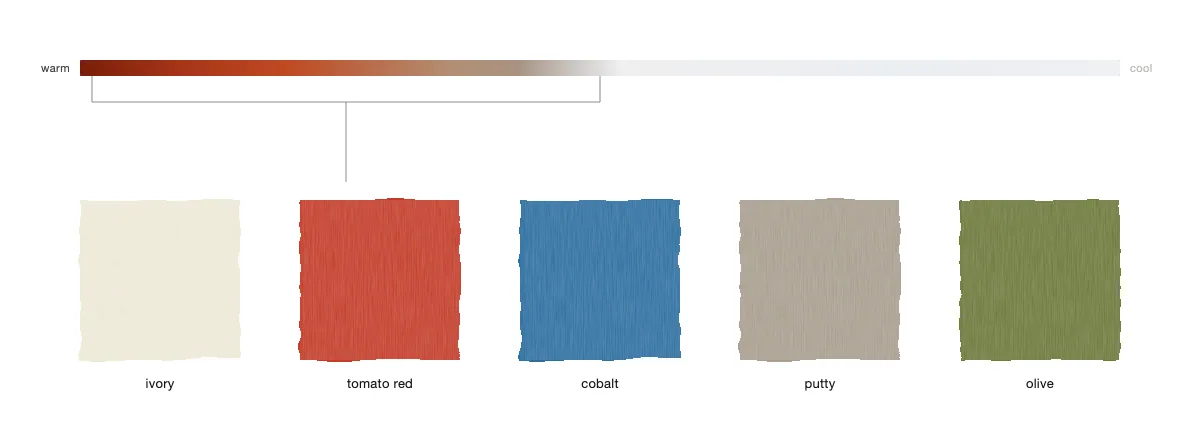
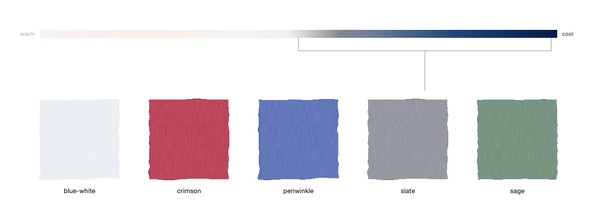
Warm harmonises with warm. Cool harmonises with cool. When you mix across temperatures without intention, the pieces compete at a frequency most people can't quite name, but feel. This is why some combinations you reach for every week without thinking and others you keep trying, keep abandoning, and never figure out why.
Your skin has a temperature too. Warm undertones are enhanced by warm colours near the face and subtly fought by cool ones. Cool undertones work in reverse. This is why camel looks rich on some people and draining on others, why crisp white reads sharp on some and hard on others.
Temperature matters most the closer a piece is to your face. A cool-toned top on warm skin looks wrong almost immediately. Cool-toned trousers on the same person, much less so. Shoes are almost irrelevant on this axis. Get the temperature right from the collar up, and everything below has considerably more room to move.
Reading your wardrobe
Most wardrobes already lean to one temperature. Years of your unconscious preference building toward one side of the line. The combinations that always work for you are probably temperature-coherent. And the "nothing to wear" feeling is often just a newer piece from the wrong temperature sitting in a wardrobe that's otherwise all one side.
Crossing temperatures can work, but one side has to dominate clearly enough that the other reads as an accent rather than a competitor. Navy and camel work together because the navy is dark enough to absorb the tension of the temperature mismatch. Grey and camel usually don't: both are mid-tone, both are reading as equals, and neither wins. When you mix temperatures deliberately, give one of them the room to lead.
Go through what you own and sort by temperature. The groupings that appear will probably look like outfits. Because they already are.
- Oro